Tuesday, December 18, 2007
Illustration Friday - Missing
Whenever I don't like the current Illustration Friday topic, I usually browse through the archives of topics and choose one that interests me. Since I never finish them on time anyway, why the hell should I play by the rules, right?
I believe the topic of "Missing" was posted sometime back in July or August before I started participating. I typically don't approach these topics literally, but that's probably due again to the fact that I take my time and don't adhere to the one week deadline. There are some artists who submit very literal images, yet manage to create very strong, effective, poignant pieces.
This is most likely going to be the last post before the end of the year, so to whomever is reading: Happy Holidays and a Happy and safe New Year to all.
Looking forward to 2008!
DJC
Thursday, December 6, 2007
Illustration Friday - Extremes
This is an old Illustration Friday piece that had been rolling around in my head for quite a while. I had done several sketches of this idea, but none of them were quite right to me. I finally nailed it a few weeks ago while pretty aimlessly doodling in front of the boob tube.
Then came the task of coloring the piece, which was another mountain to climb since i think my color sense and color application skills are a bit dubious at best. I know I wanted to go with an unusual color palette; something that didn't reflect normal color expectations of certain elements. For instance, I did not want the fire to be orange and yellow -- that sort of thing. I flatted the piece and fiddled around with color adjustments and saturations in photoshop for a few days until i crafted something with which i was happy. And here you have it!
I have a bunch of these in-progress Illustration Friday pieces, as I can never seem to actually finish them on time. I'm usually working on one from at least a week or two before the current topic.
The idea of extremes must have struck a slightly political chord with me when the topic was announced, no doubt due to some current event that may have been in the news at that time. As some of you may know, i can't stand overtly political art (or music). Therefore, I didn't give this character a recognizable entity as a person or group of people. To me, the word 'extremes' stood for someone who is zealous about an idea or belief. This person is not interested in hearing what others have to say and has no regard for how ridiculous/hateful/obscene/outdated/stupid, etc. their rhetoric may be. Hopefully with that being said, the illustration makes a bit more sense now. I realize that without that pretext, no one may have ever guessed that -- but that's ok. I did just want it to look cool as well. :)
Tuesday, November 27, 2007
THANK YOU!!
Thank you to all who showed your support and picked up an issue of Birds of Prey last week.
Overall, I felt pretty good about the issue, considering it was my first printed work. It's weird seeing your work in print for the first time; you have no idea what to expect, especially since there were many stages after mine in the production chain before the product is completed. Aside from my horrid cropping choices, there were points where the inker and colors looked better than I had expected, and there were also areas where I thought color choices were somewhat lacking.
This issue showed me that 1) I've got a hell of a lot to learn, 2) I've got a hell of a lot of competition, and 3) if you keep working hard, you'll grow. (All of these I've already known for as long as I can remember, but there's nothing wrong with a little consistent reminder to keep you on your toes.) I was really nervous working on this issue. The pages that I'm currently working on for my new projects are flowing out of me with much more ease and confidence. The Birds of Prey issue, while completed only 2.5 months ago, seems like ages.
Thanks again.
Friday, November 16, 2007
Steel!
When Superman died in the early 90's, this was one of his replacements that showed up to be Metropolis' primo superhero. I actually really like this character's look for some reason, and he was fun to draw. I have no idea what his powers are. As far as I know, he's just a dude in a metal robot suit, which should really give you any power you want. If you wear a metal suit (including metal thong --- shrinkage, ya know?!) and it doesn't do everything you want, you got screwed. So my version of this character has some sort of electricity that shoots out of his hand to meet the needs of this week's cornball drawing technique. Works for me.
Tuesday, November 13, 2007
Monday, November 12, 2007
Faces - Silver Sable
OK, so now that this week's fun thing to do is draw with a metallic silver marker and white-out pen on toned paper, I naturally have to find characters that would fit into this cheeseball aesthetic I have set-up for myself until I'm bored with it in about four days. Today's is villainness Silver Sable, who... um.... I don't really know anything about her other than she wears silver and has white hair and probably wears frosted lipstick. Luckily for me, that's all I really need to know!
Tomorrow's post will be sweet-as-sugah X-man Rogue and on the drawing board after that is DC Comics's Steel! Any other suggestions?
Thursday, November 8, 2007
Illustration Friday - Hats
When you live in New York, you'll notice that the slightest indication of seasonal change is more than enough reason to don your latest favorite accessories. That first nippy breeze in September brings out the scarves. Those damp, rainy October days call for your new golashes. Now that we're a week into November, you can only imagine...
With all the characters I see in this city, the idea of 'hats' as a theme was a good one, because the variety you see is countless and it's interesting how the hats reflect the personalities of the people wearing them. All these characters were drawn from imagination, and I could have (and should have) achieved more variety from real life observation while drawing.
Hope you enjoy them!
PS -- Yes, I know some of the characters aren't wearing 'hats' per se, such as the headband dude and the earmuffs guy, but they're close enough ;)
Labels:
cartoon,
hats,
illustration friday,
pen and ink
Tuesday, October 30, 2007
Saturday, October 27, 2007
The Mighty Thor!
I recently discovered how much I love drawing Thor. His costume is great and he is a very powerful character. I found a sample comic script starring Thor on the Internets, so I thought I would take a swing at them before I get started on my next "real" comics project. This sketch is just one of several I did to get the feel of the character.
I like the composition of the sketch, and I think I got his weight just about right. However, I feel his pose could have been more dynamic. He looks like he is lightly punching something, instead of walloping some poor schmuk. Next time I'll make him look more godly, I promise.
Enjoy!
Wednesday, October 24, 2007
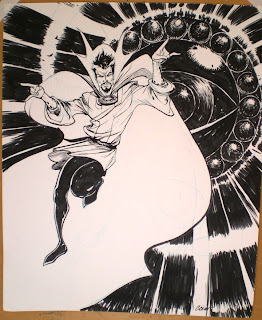
Dr. Strange
Another quick sketch -- this time of Doctor Strange and the Eye of Agamotto! Sorry for the poor picture quality, but there was no way I could scan this one!
Labels:
comics,
doctor strange,
marvel,
pen and ink
Tuesday, October 23, 2007
Which superhero are you?
Your results:
You are Hulk
Click here to take the Superhero Personality Test
You are Hulk
| You are a wanderer with amazing strength. |
Click here to take the Superhero Personality Test
Conan Sketch
Friday, October 19, 2007
Thursday, October 18, 2007
Illustration Friday - The Blues
Here's my contribution to last week's Illustration Friday topic of "The Blues." My concept for this piece was rejection, and how it can spin us into quite a blue state of mind. So maybe this poor little guy was just given the boot by his girlfriend -- and feels like a its never gonna get better. In retrospect, I probably shouldn't have made him so 'emo' due to the fact that its typically hard to feel sympathy for those people. It's like they're asking for it. :)
Kidding.
This posting should probably be for this week's topic, "Extremes," but I'm a little behind due to my workload this week. I have a sketch for the topic, and would like to go to final with it, but doubt I will get it done in time. One of these weeks I'll get it done on time.
Wednesday, October 17, 2007
Practice Pages
Did these two pages just for fun. I wanted to try out some pacing techniques.
I've learned that even when the writer has specified a certain number of panels on the page, most writers and editors won't have a problem if you stray from that number for the sake of storytelling. For instance, on the first page, the middle three panels could have been executed in one panel had I chosen to do so. I could have had the guy outside of the alleyway with junk being thrown past him while being suddenly blinded by the lights of an oncoming car. This would not be anything unusual for a writer to ask for in one panel. However, I chose to decompress this bit of action into three panels which hopefully added more of an element of time to the scenario.
Hope you like them!
Wednesday, October 10, 2007
Birds of Prey #112
It's been a while since I've last posted. I will have lots of new work to show very soon, but in the meantime, I'm posting a link to the solicitation for the comic book I drew. It's a fill in issue for DC Comics' Birds of Prey title, and will be my first published work in the comics industry.
I'm very excited for its release and can't wait to see the results of everyone's collaborative efforts. November 21st can't come soon enough! You can view the solicitation here!
Thursday, September 27, 2007
Wednesday, September 19, 2007
Tuesday, September 18, 2007
Faces - Beast
Kudos to whomever designed this version of the Beast. I like this design MUCH better than the version used throughout the 70's, 80's, and 90's. Here, he looks cat-like rather than just having ambiguously beastial features. Because they decided on a certain animal, I feel that now a much larger range of emotion can be achieved with the character's face.
Actually, when I was little and first getting into comics, the characters of Beast and Logan (Wolverine when not in his costume) confused the hell out of me due to their similar hair, ESPECIALLY when they were on the same team. I would think, how did Wolverine suddenly turn blue and (even more) hairy?! Is it a clone? How, Jim Lee?!?!?! HOW?!?!?!
I think this is my favorite out of the sketches so far.
Faces - Two Nightcrawlers
...and Nightcrawler, too. Waiting there for me, yes I do...
Yes, the first attempt (the dark one) is a mess. I feel like I was looking too much at too many artists' takes on this character, which is why he looks so... combined. First of all, I used that silly middle-of-the-face shadow, as if light sources are constantly hitting his face at equal distances from the left and right. I don't have a problem with this, its just that most of the artists who have pulled this look off are old-school rough layout pencilers and brush-only inkers. Like old John Romita, Jr. style. However, since I usually pencil tightly and use a brush pen which can achieve very fine detail, I don't think this look is conducive to my style.
I like the second attempt better, but still do not feel that I have captured the essence of this character's face yet. His face is still too long and narrow and structured. Too 'model-ish.' Even though he has fangs and pointy ears, he does not read as an elf to me. The general shape of his head needs to be more egg-like and less square. However, I do like the texture of the hair more on this one than the first.
I'll have to keep trying with Nightcrawler until I get him right. Alicia, wanna show me how it's done? :)
Monday, September 17, 2007
Impending Doom Acrylic Sketch
Was just playing around with some acrylics and cardboard and created this little apocalyptic scene. Originally, behind the wall of fire, I intended to put a pile of lawnmower gas cans. However, because this piece was immediate and suffers from lack of planning, the composition and colors didn't reflect the chaos that I wanted. I am happy with the way the two characters are painted as well as how they are interacting. (The bird figure is laying pill eggs that the sea monster is trying to catch. Should he catch them, his body will be restored and he will have a better chance of escaping the insanity and doom.)
After this piece was scanned, I did a slight color adjustment on the background in photoshop.
Wednesday, September 12, 2007
Faces - Darby Crash
This one is a departure from the rest, just because I felt like doing something different and because this sketch is serving as a study for an upcoming illustration. This is Darby Crash, co-founder of classic punk band The Germs. This was the first time I have shaded a drawing with a pencil in years, and I'm pretty pleased with the results.
I worked from a photograph, but slightly exaggerated the facial features to give the drawing more character. Which, to some, may make it seem like I worked from a photograph even more.
Don't be like that.
Faces - Commissioner Dolan
This is another quickie, this time of pipe-gnawing Commissioner Dolan from Will Eisner's 'The Spirit.' I drew his face a little thinner than his current incarnation as drawn by Darwyn Cooke, but the square jaw and squinty irritation are there. His facial structure sort of reminds me of a less exaggerated Popeye, not to mention the pipe.
Friday, September 7, 2007
Faces - Kid Flash
Thursday, September 6, 2007
Faces - Doctor Octopus
DORK!!!
Man, with a name as cool sounding as Doctor Octopus, I think Marvel really missed the boat on this guy in terms of his look. He looks like he's in a custodial one-piece with a turtle-neck underneath.
Yes, I know all those early villains had a bright, colorful, amusement park funhouse look to them, but most were eventually transitioned into something a little darker and scarier. This guy still has that really mod, 60's vibe about him. Sure, the second SpiderMan movie did a good job interpreting him for the silver screen, but in comics he still sticks out like a sore thumb as being too hokey and unthreatening.
Wednesday, September 5, 2007
Faces - Namor
I've decided for the next little while, my daily sketches (not all, but at least one of them) will be devoted to practicing faces. I'm starting off with guys, then doing a week of girls, and then maybe a week of freaks, monsters and robots. The purpose of these sketches is to become proficient in drawing all sorts of faces. For instance, in my week of guys, there will be a young guy (boyish), an old man, etc., with varying facial features such as an oval shaped head, round head, square jaw and pointy jaw. Same goes for the girls.
Each sketch will also be limited to about 15 minutes and will serve to help me become more aquainted with my brush-pen as my inking skills need work too.
Here's Namor.
I'm Back.
And yes, my head feels much better now, thank you. I've just completed a few large projects and am looking forward to once again updating my blog on a regular basis. Look for more sketches, comics stuff and personal pieces rollin outta this blog on a daily (well, no promises... let's say 'weekly,' -- just to cover my ass) schedule.
Tuesday, August 14, 2007
Silver Surfer - 20 min.
I haven't even seen the second Fantastic Four movie featuring this character yet, but I'm lovingn Pasqual Ferry's art on Ultimate FF, so I thought I'd give ol' Norrin Radd a try. Quick gripe first, though: Pasqual Ferry's art isn't inked, which is fine. Same goes for Leinil Yu on Avengers. However, WHY are the colorists on BOTH those books going so very very DARK with their work???? You can barely tell what the hell's going on half the time!!! Even on good quality, glossy paper stock! It's a complete waste of two people's month's worth of work! Setting a mood for the book is one thing, but who wants to pay for a comic where the art is a dodgy mess? Stupid! Stupid! Stupid! Blame the editors, I guess. It's their call.
This piece is mildly successful for a 20 minute sketch. I think it's pretty clear I was going for a fish-eye lens, actual-surfer effect. However, I completely slaughtered the proportions, especially on the upper half (look at that freaking thimble of a head). Still, I like the motion of the piece and am trying to incorporate a more fluid, animated element into my work. I'll keep trying!
Oh, also, I think I need to start doing these sketches on larger paper. Standard letter size is awfully cramped. I think the reason I do it, though, is because I need a bigger scanner. There's no way I'm going to do multiple scans and frankenstein them together for the sake of this blog.
Thursday, August 2, 2007
Seussical the Musical
This is a characature painting done for my cousin who recently starred in a youth theater production of 'Seussical the Musical.' I understand his part had to do with Horton, but I threw the Lorax in there for good measure.
The painting was done with acrylic on paper, with a gloss gel medium as a finish, mainly to make the paper even more sturdy. Sorry about the lighting. They were taken in my basement, but I should have gone upstairs where there is more natural light.
Wednesday, July 25, 2007
Old Stuff
Tuesday, July 24, 2007
Saracen
Here is the third sketch I said I would post. Its of another lame villain called Saracen, who was apparently a middle-eastern terrorist and foe of the Punisher (don't you just LOVE Marvel in the 70's?). Actually, I think this character is from the 90's, but seems like it would have fit into the onslaught of stereotype characters from the 70's such as Shang-chi, Power Man, etc., when Marvel jumped on the exploitation bandwagon. I'm sorry I skimped so bad on the background, because that town outside the window could have been a tad more believable. Overall, I am pretty happy with this sketch. He kind of looks like Borat, though. I should have applied some shadows to the figure as well, but didn't want them to distract from the linework and overall shape of the character. This sketch was completed in about 20 minutes.
Monday, July 23, 2007
"Twosies beats Onesies"
"But nothing beats three."
A little 'Cabaret' for you folks right there.
And the third is coming tomorrow.
The first sketch, Archangel, was done in october of last year. I used a variety of Micron Pens, and wasn't too happy with the results. It was at this time when I was introduced to the Staedtler brush pen I spoke of in another post. This was also the time at which I decided to start doing quick character studies. Unfortunately, I don't think I did another for a couple months after this piece. I'm getting back on track now, as I try to do one almost every day. This Archangel piece took me about an hour, if memory serves me correctly.
The second sketch, done the other day, is of a lame Spiderman villain called Carrion. In the few old Spiderman comics I have which feature this character, I don't even think he speaks. He just kind of hovers around looking ghastly, which I guess could be cool in its own right if you wanted. I like this villain because DAMN, he must STINK! Honestly, this guy must smell like rotting chicken. I always thought he should have been drawn with a more decomposed look than he normally was, but that's just my take. However, it would have pre-dated the zombie fad by about 11 years. This sketch took me approximately 35 minutes and was done with a brush pen.
Thursday, July 19, 2007
Black Cat
Here's a sketch of the Black Cat (I think that's her name) character from the Spiderman comics. I think it was completed in about 10 minutes or so. I used a great new toy of mine, the Steadtler Mars Graphic 3000 Duo, an incredibly long and nerdy name for a pen. Maybe it's justified in the fact that this pen is so awesome.
It has two usable ends, one being a normal marker and the other being the "brush" side of the pen. I know this double-sided thing is nothing new. Neither is the idea of having a brush pen. However the MG3000D (ha!) stands above the rest for a few reasons. First, the brush is incredibly versatile. It can produce a wonderful range of line thickness, including very fine and delicate lines, much more so than other brush pens I have tried. The second great thing about this pen is the fact that the brush is actually rubber, and not fibers. Therefore, the brush always retains its shape and can still produce fine lines even after repeated hard use. Brush pens, like other marker tips, will eventually break apart and only give you fat nasty lines all the time.
Anyway, I'm planning to do a quick drawing every morning before I begin work just to loosen up and have some fun. Also, I've decided I want to use my favorite lesser known heroes and villains for these sketches. So you won't be finding any Superman or Wolverine here! I guess I will also open this up to suggestions, so please leave a comment with any character(s) you would like to see.
Wednesday, July 18, 2007
Play
Did this drawing a while back and colored it in Photoshop yesterday. I don't really know what Ben Franklin, a triceratops and the Cabbage Patch-esque bust have to do with one another. When I was drawing, there must have been some stimulation or inspiration with those elements around me (actually, I think I was bored at work). Regardless, I just sort of let my pen go wherever it wanted and this is what happened.
Tuesday, July 17, 2007
Of a Friend
Trying to get back into painting with acrylics. Its a tough process, let me tell you. With this particular painting, I decided not to do smooth blends of colors and values. Rather, the paint was applied with a more deliberate separation between colors, thereby allowing "the eye" to do the blending.
I think I was moderately successful in my attempt, although I think when painted this way, the mid-to-high-tones look like the flash of a camera is striking the person's face. In this case, it was, as I was working from a combination of memory and a crappy 3x5" computer printout from a digital camera. This person is rather dark skinned, but I made him waaaayyyy too red. Looks like he just stepped off the beach.
Although awkward-looking, this painting has inspired me to continue painting. I've been working with acrylics for a number of years now, but have only recently become "comfortable" with them. I would much rather paint with oil. However, due to cost issues, time to dry and overall messiness, oils are just not in the cards right now. Oils are for when you have your own shed in the back of the house that is yours to do whatever you please and you can make a huge shitstorm mess and never clean it up and no one cares. Regardless of medium or how much formal training you have had, painting is an intensely personal process that can not be fully taught to anyone. It's up to you to decide what you feel is working and what is not. There is no step-by-step. You need to be in constant communication with the medium. Work WITH it, don't force it. If something you have been taught is not working for you, SCRAP IT.
More later.
Monday, July 16, 2007
Wednesday, July 11, 2007
Gen13 Comic Samples
The following three pages are my latest round of comic samples. I feel that they are the strongest that I have done so far; displaying many of the tips I have received from professionals along the way. There are two pages left to this particular sample. These two other pages are from the same 22 page script, but a different scene that includes the rest of the Gen13 team.
I took these samples to WizardWorld Philly in June and got a very positive response. I am looking forward to finishing these, along with several other 3-page samples before I go to San Diego Comic Con International later this month. Looking at these pages now, about three weeks after their completion, I think my main criticism has to be that my anatomy, while more precise than in previous samples, is still rather stiff. Luckily, this can only be fixed through more STUDYING and more DRAWING!
One tool that I have found that has already loosened my work up a bit since I have started drawing with it only a couple months back is a non-repro blue pencil. For those who don't know, this is a special kind of pencil that does not show up when copied or scanned. Thus, no erasing! Also, I think the fact that I know it is not the final pencil line allows me to loosen up ON the actual page. The lead in the pencil is softer and a bit waxy, which is a nice change from the rather harder leads that most comic artists use. For whatever reason, I'm always so happy with the expressiveness and looseness of the blue lines that I put down. So right now non-repro blue pencils are on the top of the list as far as useful drafting tools for comic artists. In the next few posts maybe I'll tackle lightboxes and Google SketchUp.
Friday, June 22, 2007
Sad Sack of Circuitry
Also part of my "Sketchbook Series" that I have been posting.
This lonely little fella was so sad and heartbroken, he KERRRAAASSSHHHEEDD his space car into a distant, forgotten moon just to get away. Of course, we can't hear (and thereby read) what our robot is saying, but I'm assuming it's Morrissey.
Monday, June 18, 2007
Sketchbook Series
Recently, I've been sketching more from photographs to later translate into my comics work. It's been helping with my anatomy, draping of fabric and also helping to achieve more natural poses. I've turned to Sports Illustrated, wildlife books, the sports section of the local paper and would like to start drawing from books on WWII and National Geographic magazines. Since I am just getting back into this, I've been going for more "complete" drawings rather than giving myself time limits of 10 or 30 seconds or 1 or 2 minutes to do a sketch. I think I'll start working on those sketches as well to improve the fluid movements of my characters. But look how scared that long jumper is of that mountain lion!
Subscribe to:
Posts (Atom)